
Let’s be honest: most business and technical ebooks are a chore to get through. You download a guide hoping for actionable insights, only to be met with an uninspiring wall of text, rigid margins, and zero visual breathing room. It feels less like an engaging guide and more like a dry corporate manual.
Just like in web development, the “more is more” trap ruins digital publications. People try to compensate for a lack of structural clarity by adding heavy decorative borders, watermarks, and overly complex color schemes that scream “amateur.”
An ebook is a digital product. If you want people to value your expertise, the presentation needs to feel premium, high-end, and effortless to read.
Here is how to design a simple, beautiful, and eye-catching digital guide that commands authority from the first page to the last.
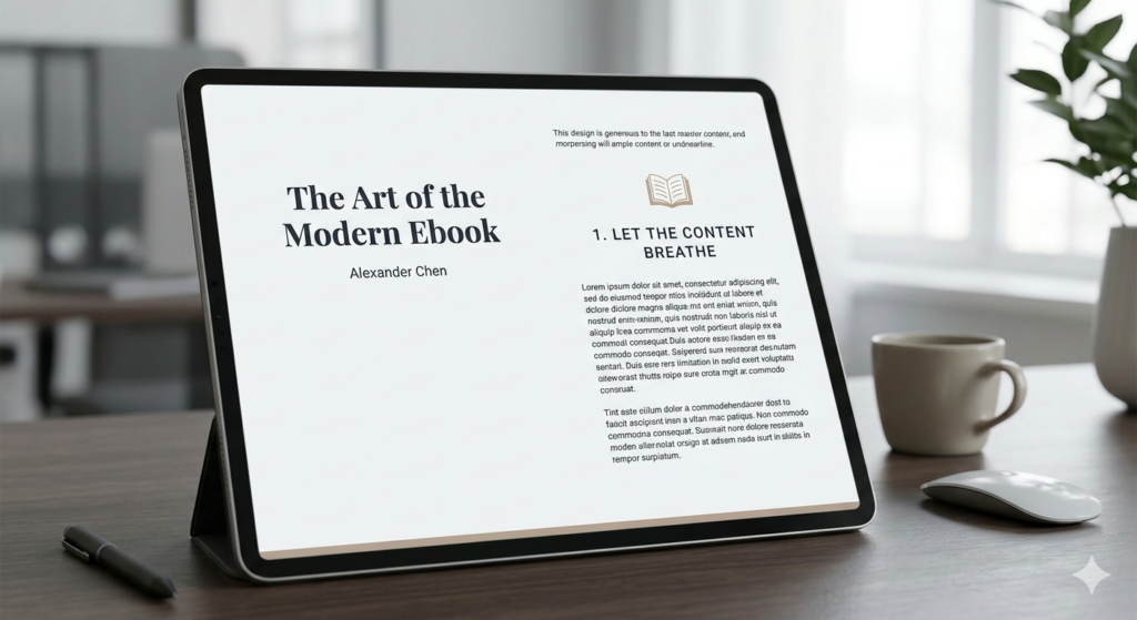
1. Let the Content Breathe (Generous Margins and Whitespace)
When designing for a screen—whether it’s an iPad, a laptop, or a smartphone—eyes fatigue quickly. If your text is crammed right up against the edges of the page, or if your line spacing is too tight, readers will skim right past your best points.
To create a layout that feels premium, prioritize white space:
Set massive page margins. Give your text blocks wide breathing room on the left and right. This instantly mimics the feel of a high-end print editorial.
Increase your line height. A tight line height works for a printed paperback, but on a digital screen, you want your line spacing set to at least 1.5x or 1.6x the font size.
Break text into bite-sized blocks. Keep paragraphs short—no more than 3 to 4 sentences. Use clear, prominent headings to let readers anchor themselves as they scan through the material.
2. Ditch the Decorative Clutter and Artificial Elements
One of the biggest mistakes creators make is over-decorating their pages. If your content is strong, you don’t need to overcompensate with artificial design tropes.
Ax the heavy background patterns and textures. Stick to clean, solid backgrounds. A stark, crisp backdrop ensures your text remains perfectly legible and your layout stays timeless.
Remove redundant logos and running footers. You don’t need your brand logo stamped on the corner of every single page. It adds visual clutter and screams “corporate pitch deck.” Keep your branding elegant: a striking, minimalist cover page and a clean closing page are all you need to establish identity.
Say no to filler graphics. If an icon or abstract graphic doesn’t directly illustrate the point you are making in that exact paragraph, remove it.
3. Establish a Restrained, Sophisticated Color Palette
A common temptation when creating an ebook is to use a wide array of accent colors to separate different chapters or sections. This quickly breaks the cohesive flow of the book. Instead, adopt a strict, minimalist color strategy:
Pick one or two dominant colors. Use a crisp, dark tone for your body text to ensure maximum readability, and a single, high-contrast accent color reserved strictly for callout boxes, major chapter titles, or key metrics.
Embrace intentional color blocking. If you want to break up a long, text-heavy chapter, use a solid color block for an entire page to transition into a new topic. It acts as a visual reset for the reader’s eyes without introducing messy design elements.
4. Use Realistic, High-Impact Visuals
An ebook shouldn’t feel flat, but any imagery you include must match the professional caliber of your layout.
Focus on realism. If you are showcasing mockups, layouts, or digital tools, use clean, high-resolution, realistic renders. Avoid overly stylized or generic stock illustrations that look artificial.
Embrace crisp container boxes. If you need to highlight a tip, a case study, or a critical warning, place it inside a beautifully structured container box. Keep the borders razor-thin (1px) and use a very soft, subtle background tint to make it pop from the rest of the page without creating visual noise.
The Bottom Line
When you strip away the busy borders, the repetitive logos, the unnecessary graphics, and the forced over-theming, you are left with what truly matters: your knowledge, presented with ultimate clarity.
A minimalist digital guide isn’t just easier on the eyes—it projects confidence. It tells the reader that your insights are valuable enough to stand on their own without needing a coat of artificial paint to look interesting. Next time you’re formatting a page, remember the golden rule of premium design: if it doesn’t add value, take it away.