
We’ve all seen it. You open a website, and before you can even figure out what the company actually does, you’re hit with a barrage of micro-animations, conflicting fonts, and overlapping decorative elements. It’s loud, it’s distracting, and honestly, it’s completely unnecessary.
Somewhere along the line, the web development world got trapped in a “more is more” mindset. There’s a common misconception that to make a site look “premium” or high-end, you have to pack it with complex thematic graphics, intricate background textures, or heavy visual noise.
But if you look at the most successful, high-converting modern sites, the secret isn’t complexity. It’s restraint.
True luxury and professionalism on the web don’t come from what you add; they come from what you have the discipline to leave out. Here is how to strip back the noise and build clean, high-impact layouts that look incredibly sharp without trying too hard.
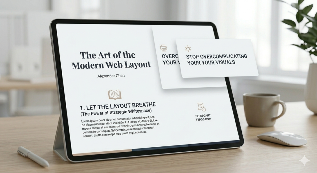
1. Let the Layout Breathe (The Power of Strategic Whitespace)
Whitespace—or negative space—isn’t “empty” space. It’s a design element in its own right. When you crowd a webpage with text blocks, icons, and decorative accents right next to each other, you create cognitive overload for the user. If the user’s brain has to work to parse your page layout, you’ve already lost them.
If you want a layout to look premium, you have to let it breathe.
Give your sections massive padding. Don’t be afraid of generous vertical spacing between your content blocks. A standard margin often isn’t enough; give hero sections and product features the room they need to command attention.
Group intentionally using the Law of Proximity. Keep related elements close, but give distinct ideas room to stand on their own. If a user can tell which caption belongs to which image instantly, your layout is doing its job.
Prioritize hierarchy over decoration. Instead of adding a graphic to “fill space,” increase the size contrast between your headers and body text. Let bold, beautifully rendered typography do the heavy lifting.
2. Ditch the Thematic Clutter
One of the easiest traps to fall into is over-theming. If you’re building a site, you don’t need to lean into literal, heavy-handed motifs to prove a point. A modern layout should rely on structure and realism, not artificial flair.
Ditch the random filler graphics. If an image, icon, or decorative shape doesn’t serve a direct functional or brand purpose, delete it.
Keep your backgrounds clean. Step away from complex patterns or heavy color gradients that clash with your content. A crisp, solid backdrop creates a stable anchor for your product shots, portfolio pieces, or text.
Focus on realism over artificiality. When you do use imagery or mockups, opt for clean, high-resolution, realistic visuals. Artificial or overly stylized graphics can instantly cheapen a modern layout. If you are showcasing a product, let the high-quality product render speak for itself instead of drowning it in background noise.
3. Mastering Clean Layering and Visual Depth
Minimalism doesn’t mean a website has to look flat, sterile, or boring. You can create an incredible sense of depth and visual sophistication using subtle, clean layering—without ever cluttering the screen.
Think about using crisp text overlays on top of sharp, high-contrast container boxes, or utilizing a subtle “glassmorphism” effect where elements softly overlap. The trick here is execution:
Keep your borders razor-thin. Heavy borders instantly age a site. Stick to sleek 1px borders with precise color coding to separate containers cleanly.
Use incredibly soft, diffused drop shadows. If you use shadows at all, they should be barely noticeable—think large blur radiuses with very low opacity. Alternatively, skip them entirely for a flat, modern brutalist look.
Ensure there is immaculate alignment. When a layout is simple, your alignment needs to be flawless. A single misaligned pixel stands out like a sore thumb when there’s no clutter to hide it. Stick rigidly to your grid system.
4. Technical Execution: Keeping the Code as Clean as the Visuals
A clean layout shouldn’t just look minimalist on the frontend; it needs to be built with structural integrity on the backend. True minimalism means optimizing the performance under the hood.
Streamline your DOM structure. Avoid “div soup.” Every unnecessary wrapper or container you add just to force a visual layout adds bulk. Use clean Flexbox and CSS Grid properties to handle alignment natively.
Optimize your media assets aggressively. If you are using high-resolution, realistic imagery to anchor your design, ensure it is optimized. Convert images to modern formats like WebP or AVIF, and implement responsive image sizes so you aren’t serving massive files to mobile users.
Limit your font weights. Just because a premium variable font offers nine different weights doesn’t mean you should use them all. Stick to two, or at most three, consistent weights (e.g., Light, Regular, and Bold) to keep your global style sheet lightweight and visually unified.
The Bottom Line
When you strip away the unnecessary filler, the extra logos, the busy textures, and the forced themes, you’re left with the core of exceptional web development: clarity, functionality, and pure aesthetic balance.
A simple, beautiful, and eye-catching layout will always outperform a cluttered one. It loads faster, it scales beautifully across devices, and most importantly, it directs the user’s eye exactly where you want it to go.
Next time you’re building a section and feel the urge to add one more decorative element to make it look “complete,” try doing the opposite. Take something away. You might be surprised at how much better it looks.